Thursday, 28 April 2011
After showing my previous contents page to a focus group I found that they thought it was quite boring. There was also a number of other issues raised such as the non-consistent colour scheme which the focus group said did not look good. The layout of the contents page was also highlighted. Therefore I decided to start again, following the same style and colour blocks I created a contents page that flowed nicely from the front cover.
Thursday, 7 April 2011
Contents page ideas
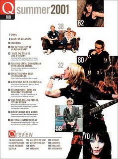
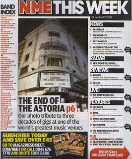
 As I have a rough idea how I would like my contents page to look, I have only researched a couple of contents page ideas, this has been very useful for me as it has helped to certify my ideas and see how other magazines do their contents pages. Although my magazine has a pop genre and these three magazines are more rock and R&B, they have still helped me to get some ideas. I particularly like the way the magazine on the bottom left (Q) has put white page numbers on the pictures with information down the side. I think that is something I may try with my own magazine as I feel that it looks quite good and is also eye catching.
New front cover design
Having continued with my front cover, I felt that the quality of my picture,and the layout of my magazine was poor. It did not have the desired effect and the cover lines did not look very interesting and eye catching. I also found that the colour scheme of my magazine was not very eye catching which had a bad effect on the entire front cover and contents pages layout. I felt that by using Adobe premier, it made my picture blotchy and the cut out around the edge was poor. I also felt that although I did really like having the Masthead behind the model as a couple of other magazines I looked at had done, My magazine name was not well known and therefore I felt that i should try to show the masthead off and make it more clear.
Therefore I began a new front cover and hoped that it would look better and more effective. Before this I also looked at the examples of other magazines and looked at the use of colour schemes throughout their magazines and which were the most popular. I really liked 'Q' magazine's colour scheme of Red, White and Black, which I had also looked at in my preliminary task.
This is what I have produced so far for my front cover and I feel that although it is simple, I feel it is effective and looks eye catching-
I do not feel there are many more things I can add to this front cover, however I have noticed that a number of things need to be moved, for example 'Christie Montoya' needs to be moved over as the 'ri' cannot be seen. I think that the new colour scheme, new picture and new layout work well together and the magazine looks much more professional.
I will now explain what programmes I used, and how I created this new front cover.
Picture+Background
Using Adobe Photo shop I was able to use the cut out tool which cut around my model and this then enabled me to remove the background and edit the background into a more appealing background as apposed to the green screen. Using a background effect I was able to control the colour of the background, the angle the colour layed at and also how high or low the colour was.
Layout
Using publisher I designed the layout of the magazine, I inserted shapes lines to break up the magazine as I saw that that was also what a number of magazines did and this made my magazine look more professional.
Fonts
I have used a number of different fonts and styles including italics and bold to help different parts of the magazine stand out and more important things be seen clearer. I also used different fonts for different parts of the magazine.
I now need to edit small parts of the magazine which will help it to look clearer.
Subscribe to:
Comments (Atom)


