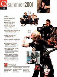
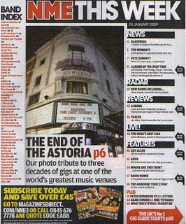
 As I have a rough idea how I would like my contents page to look, I have only researched a couple of contents page ideas, this has been very useful for me as it has helped to certify my ideas and see how other magazines do their contents pages. Although my magazine has a pop genre and these three magazines are more rock and R&B, they have still helped me to get some ideas. I particularly like the way the magazine on the bottom left (Q) has put white page numbers on the pictures with information down the side. I think that is something I may try with my own magazine as I feel that it looks quite good and is also eye catching.
Thursday, 7 April 2011
Contents page ideas
 As I have a rough idea how I would like my contents page to look, I have only researched a couple of contents page ideas, this has been very useful for me as it has helped to certify my ideas and see how other magazines do their contents pages. Although my magazine has a pop genre and these three magazines are more rock and R&B, they have still helped me to get some ideas. I particularly like the way the magazine on the bottom left (Q) has put white page numbers on the pictures with information down the side. I think that is something I may try with my own magazine as I feel that it looks quite good and is also eye catching.
Subscribe to:
Post Comments (Atom)


No comments:
Post a Comment