Monday 28 March 2011


Initially i wanted my front cover to have a white background with my main picture..... blah... didnt work.... eyes... next plan  FINISH

Sunday 20 March 2011

Editing cont.

Continuing with editing my picture I decided that I wanted to the background to be white, however to do this I had to go through a number of procedures.

1. Upload my picture onto Adobe premiere, where I then applied the green screen effect, this changed the background to black (As shown on the previous post)
2. The I found a plain white background, which I also uploaded to the application.
3.Using the video time-line I was able to layer my two pictures which would eventually change the background to white.

However as you can see this affected the eyes of the picture where they turned white with the background. So to change this I had to remove the white background and think again about a different colour background to use. I went through a number of different colours to see if any of them would not affect the eyes. Eventually I found a purple-blue background which not only looked suitable but it also affected the eyes in a positive way, it made the eyes turn a nice colour and made them look much more striking.
This is my final picture for my front cover and what I intended to use as the background of my magazine.

When decided on the name of my font cover I could then edit in the Masthead of my magazine. I thought that I could simply add a text box and that would work well, however i then remembered that I wanted the masthead to be slightly behind the head of my picture as that is what the other examples of magazines I had looked at do and i think that it looked very professional. Therefore I tried this and found that as my picture was edited in layering with the background, I was unable to put the text behind the head. With that I decided to go back and edit the masthead into the background using paint and save that as my desired background, then eventually with lots of editing and moving I was able to then layer the picture on top of the masthead and picture. With the final picture looking as followed.


Sunday 13 March 2011

Editing my pictures


As I have taken this picture in front of a green screen I thought that it would make it much easier for me to edit around her and transfer it onto the front cover. However I discovered that by using the programme 'Adobe Photo shop Elements 7.0' I was unable to do this without using the 'quick selection tool'  to cut around the picture which would take more time and may not look very well done. Therefore I had to use another programme 'Adobe Premiere Elements 7.0' which is actually a movie making programme but by using this I was able to use the green screen tool then using other effects such as layering I could insert a white background which gave me my final picture.
 As my picture has come out with red eye I had to use the Photo shop elements programme to edit this out as red eye does not look professional, I also adjusted the colour, brightness and shadows in the photo to make it look more attractive, however I may choose to edit this back as I feel it looks slightly cartoonised.

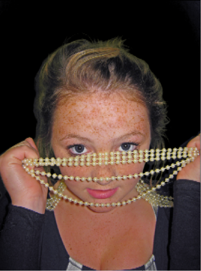
Using the programme Adobe premiere elements I applied the 'green screen tool' which has got rid of the green screen in the background and replaced it with a black one, however I wanted this to be a white background, therefore I need to apply a layering effect with a white background which will hopefully change the background to white.
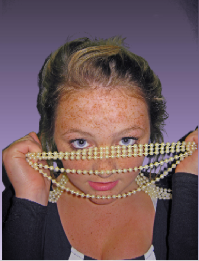
Main picture ideas

I have taken a number of pictures of a friend who will be my chosen artist, I will take a few more pictures to add into my magazine and then I will eventually interview her and she will be my middle page spread.

I began by taking pictures of her just as I have seen in a number of front covers, but I found that there was no individuality, and the pictures were not very striking. I want my magazine to have lots of character and seem individual.


Then after a number of shoots I found that by using the props of the pearls my artist could express more emotions through the pictures and they seemed much more appealing and she had a sense of innocence yet the pictures were eye catching which is how I felt about the other magazines I looked at, I also found that the pearls gave me more ideas for a theme for the rest of my magazine.

I really like these pictures I took but this is my final picture for my front cover, now I need to edit it. 
I found this picture of Pixie Lott from Q magazine edition.... Which gave me my general inspiration for the use of props, as I felt that it made the picture much more striking. I think that my picture is very similar to this picture and is mainly why I am choosing to use it.

Sunday 6 March 2011

Ideas for my music magazine- Front cover.

From researching how music magazine front covers are laid out I now have some great ideas on the genre of my magazine, the lay-out and my target audience. I now need to compare all of my ideas and then come up with colour scheme, images, fonts and a music artist.
Genre
I have decided on a genre for my music magazine and I am going to do it on pop/dance. I think that I will be able to take some great pictures on my music artist and will be able to come up with some great questions for my interview for the double page spread. I also like listening to pop/dance music and this will give me some knowledge on the types of things that my readers will be interested in.

Images
I have noticed that the 'Billboard' magazines have their masthead along the top and the a MCU (medium close up) of their music artist, who's head is usually within the masthead. As many of the magazines I looked at have done this I have noticed that it is clearly a very popular way of advertising and laying out. Therefore  I intend to do the same type of thing on my own magazine.
I will only use one picture on my front cover as it will make that one image stand out and people will be attracted to that image and hopefuly want to see more images of my artist.

Text&Font
The magazine's such as 'Billboard' Vibe' and 'Blender' have cover lines then with either a small piece of explanation text below it. These two pieces of text are usually in a different font which helps each one to stand out against the other. These cover lines are there to get the reader's attention and make them want to carry on looking into the magazine to read the full article. Therefore I must ensure that my own cover lines are short and catchy where my readers will want to continue reading the magazine. The font of my masthead and cover lines is very important too as it needs to be simple enough to read yet attractive enough for people to feel intised by it and it must also relate the my genre of music.

Colour scheme
Right now i'm unsure on what colours I should use for my colour scheme. I want to keep it simple, yes i want the colours to stand out again eachother. I think that I will need atleast 3 colours, 1 for the background colour, then two for alternating colours for cover lines and the masthead as the other magaziens such as 'Bollboard and 'Blender' do this in their front covers. These are some ideas for my colour schemes;
White- Blue- Pink
Blue- Brown- purple
Red-Yellow-Black
Grey- Pink-Black
Grey-Blue- Black
As I am unsure how each colour scheme will look when it is down as a front cover, I think i will need to create my front cover then apply each of these colour schemes to it and see which one loooks best, then show this to my focus group and decide which one will look the best.

Layout
Now I need to focus on the layout of my magazine, to do that I need to take some pictures of my music artist, chose a definate font, colour scheme and then think of some catchy cover lines.

Music magazine front cover ideas


I have researched a number of different music magazines to help me decide on what genre I should choose to base my magazine on. These front cover examples have also given me an idea on how front cover are laid out and this has given me some inspiration on my own magazine.
I really like the magazine's ' Billboard', 'Vibe' and 'Bledner'. I like the way the front covers a simple, yet effective. They stick to a simple colour scheme and how there is only one main picture of their main music artist. I think the way the have their artists name in large writing on the front is effective as it makes the reader feel like they want to know more about that music artist.
I have some very good ideas from these magazines and have a rough idea on how I will create my own music magazine front cover. I also like the way that each magazine has managed to target their magazine at a specific target audience and have managed to maintain that 'young' feeling within the front cover alone.

Saturday 5 March 2011

For my second task I am going to create a music magazine- consisting of a front cover, contents page and a double page spread. Firstly I will do some research into music magazines, then decide on the genre of my own magazine, then proceed into the creation of my magazine.

Tuesday 1 March 2011

Contents Page- FINAL DRAFT

After sitting down and showing my previous front cover to a focus group I received a number of comments on what was right and what was wrong with my magazine front cover, I then later went back and looked and my cover and decided to change and edit the following; I realised that just the two pictures looked very plain and that I needed to add more as it would give the readers more of an example of what my magazine is about and what it would contain, and having been inspired by one of my examples I found I chose to do the three over-laying wonky pictures. I felt that it looked more fun and also related to my cover lines to their left. 
I also felt that it was in need of some more colour which is when I decided to change the colour of my page numbers and the cover line, when doing this I also felt that they needed to be broken up some more which is why I chose to have the main cover lines Bold  and the explanation text in italics.
Next I thought that maybe it would be a good idea to try and link my front cover to my contents page which is why I put the red and white banners along the top and left hand side.
 Not only that but I also thought that as i had previously written ' Sheb's Sixth Sense' with each 'S' in red, I could make that a type of logo and people would recognise it and would be linked with my magazine, which is why it is at the top of my contents page too.
I chose to stick to my colour scheme of black, white and red as again it is a type of branding for my magazine and when targeting it at my target audience they would easily remember ' Sheb's Sixth Sense'

First draft of my Contents Page

This is my first draft at my contents page. I tried to stick to my original plan by which I do not make it look too busy. I tried to kept it quite simple- but by doing this think that it may look slightly boring. To make it seem more attractive I think I need to add some more colour into it- possibly my other main colour which is red, and could also maybe add in another picture.
 Another thing I did not do was add in the two banners along the top and down the left hand side, I think that by doing this it will show a link between my contents page and front cover.
 I have chosen to put my main cover lines in Italics which helps to differentiate between the cover lines and explanation text. 
Finally with my pictures I tried to use pictures that relate to the cover lines- For example, where i have spoken about sporting fixtures, I put a sporting picture in next to it, then when I said Exclusive pictures of the Rajko concert, i have put a small picture in which is aimed to make my audience want to carry on looking.

Contents page- Rough idea

Annotated contents page

I have annotated this contents page in preparation for creating my own contents page, for my school magazine. I researched the layout and the techincal terms of a magazine, having learnt these terms I will be able to create my own contents page, which also links with my front cover- using the same colour scheme and fonts for example.